Notable later editions
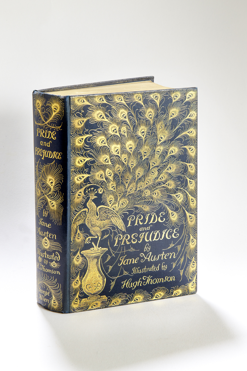
The ‘Peacock edition’:
Published by George Allen, London, 1894
Known as the ‘Peacock edition’ because of its gorgeously embellished cover, this beautiful edition is probably the most famous and collectable later edition of Pride and Prejudice. It features illustrations by Hugh Thomson, a young Irish artist who had made his name in the 1880s illustrating Mrs Gaskell’s Cranford. He went on to become one of the most popular and successful book illustrators of the Victorian era.
Although previous editions of P&P had included one or two illustrations, usually as a frontispiece, this was the first to include illustrations throughout, fully integrating them into the story. It features 160 illustrations, showing all significant encounters in the storyline.
Thomson’s ability to capture the spirit of the novel’s scenes in his lively, humorous drawings provides readers with a visual link to the story and characters that has made this edition a perennial favourite.
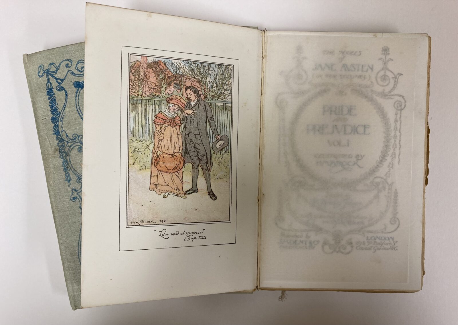
First illustrations in colour:
Published by J. M. Dent and Co., London, 1898
This edition was the first to feature coloured illustrations, created for a full series of Jane Austen’s novels by the artist brothers Charles and Henry Brock.
Coming hard on the heels of Hugh Thomson’s fully illustrated ‘Peacock edition’, this new set utilised six-colour lithography, which involved printing the same image on top of itself multiple times using different colours, to create a full colour print. This technique was more expensive than printing in black and white, so the number of illustrations was reduced: in the ten-volume set of all six novels, there are just six plates per volume.
The brothers divided the novels between them, with Henry taking Pride and Prejudice. The illustrations were drawn in pen and ink and then tinted in watercolour, creating a more vivid and detailed period representation than ever before.
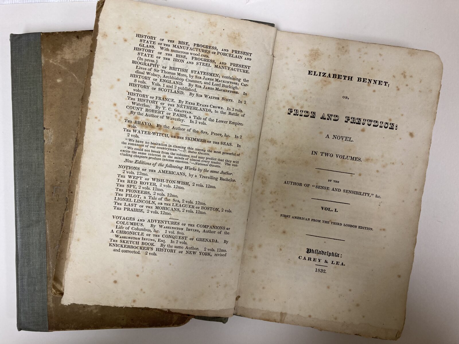
First American edition:
Published by Carey and Lea, Philadelphia, 1832
The first American edition of Pride and Prejudice gave the novel a slightly different title: Elizabeth Bennet; or, Pride and Prejudice.
In the 1800s there were no overseas copyright laws, so American publishers had free rein to print British novels.
The first of Jane Austen’s works to appear in America was Emma, published by Philadelphia printer Matthew Carey in 1816. Later, in the 1830s, Carey’s firm of Carey and Lea published all of Jane Austen’s works.
These editions were made using cheap paper and a small, cramped font to minimize the cost of production. The standard three volumes were compressed into two, further reducing costs and making the novel more accessible to a wide audience.
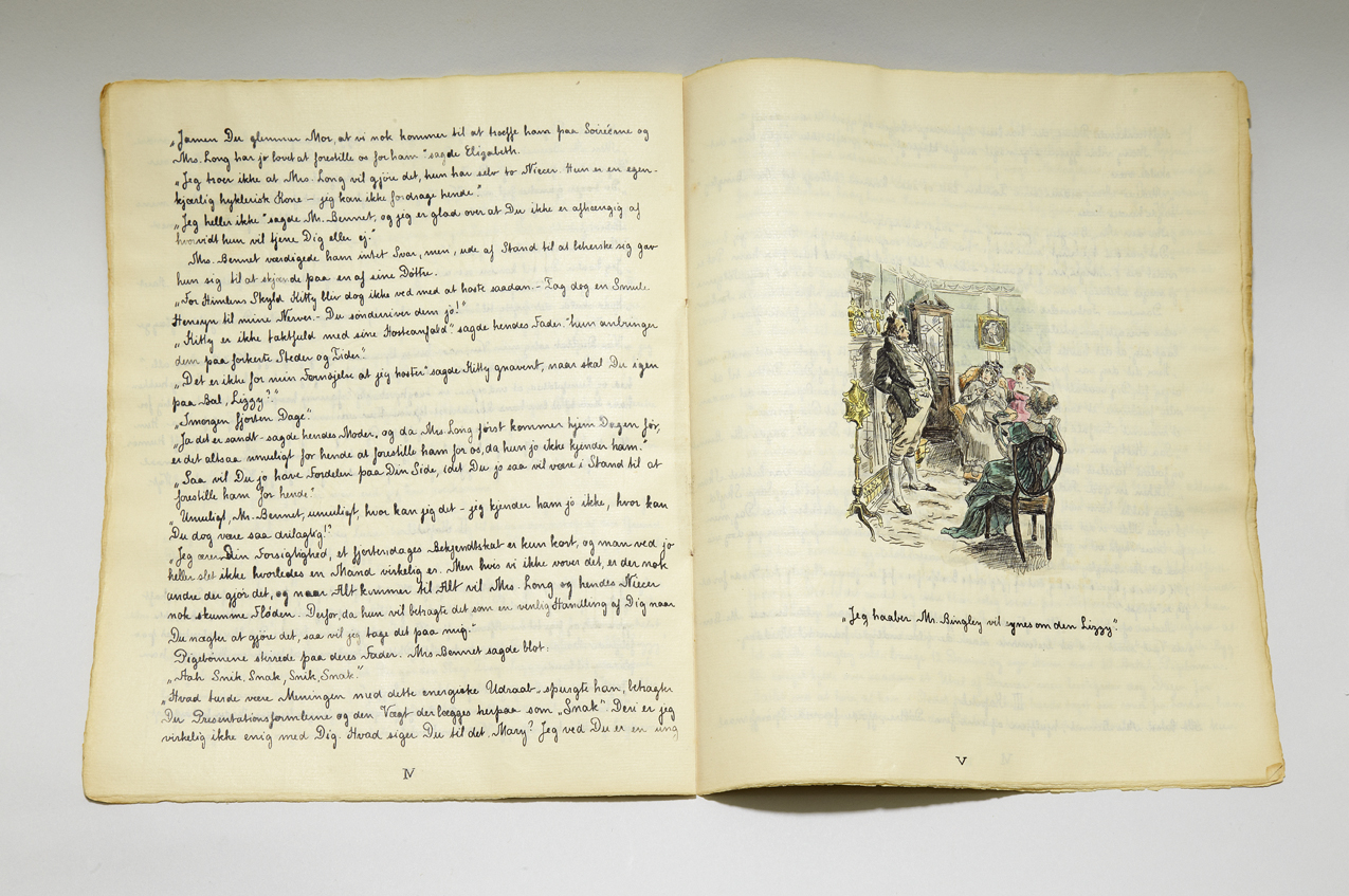
Handwritten Danish translation, 1904
This handwritten Danish translation of Pride & Prejudice was made in 1904 by two Danish sisters for their mother who did not speak English but wanted to read the book that her daughters loved so dearly. At the time there were no published Danish translations of the novel, so the sisters translated it themselves, copying it into this beautiful handmade book, along with their own hand drawn imitations of Charles E. Brock’s illustrations.
The book is made up of seventeen paper booklets bound with ribbon and held inside a linen covered hard casing decorated with embroidery to front and back.
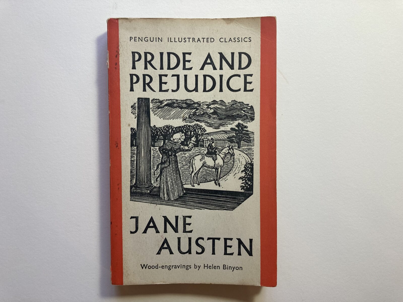
First paperback edition:
Published by Penguin, London, 1938
The first paperbacks were published by Penguin in 1935. This was a new imprint, set up with the mission to publish good books at a price everyone could afford – a revolutionary idea at the time!
The story goes that Penguin founder Allen Lane, returning home from a weekend with Agatha Christie in 1934, stood on a platform at Exeter station looking for a good read for the journey. There was none, and it was from this frustration that he founded Penguin Books.
‘Good design is no more expensive than bad’, Lane declared, a mantra that has guided the publisher ever since.
The simple, classic Penguin design is now iconic. The colours were chosen to avoid the illustrated gaudiness of other paperback publishers in the 1930s, and colour-coding made it instantly clear which category a book belonged in. Orange was the colour for general fiction.
Pride and Prejudice was published in 1938, as part of a new Penguin Illustrated Classics series.
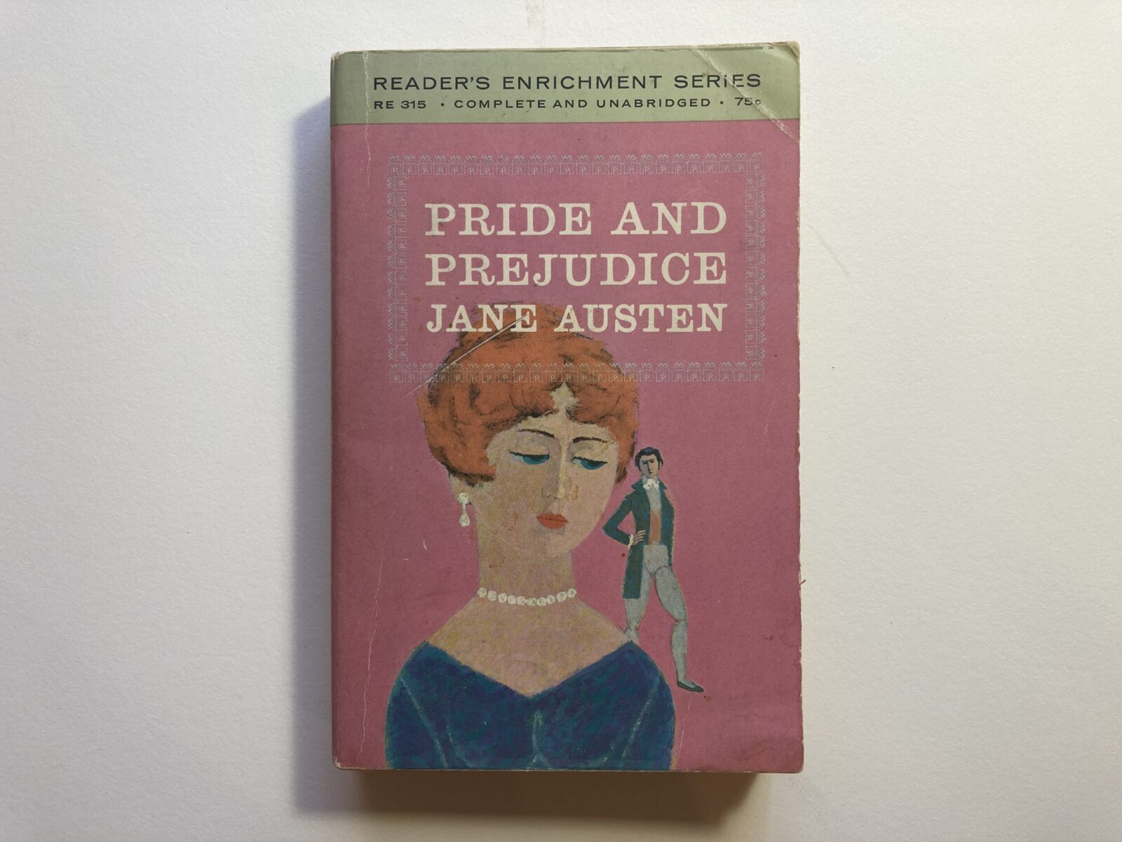
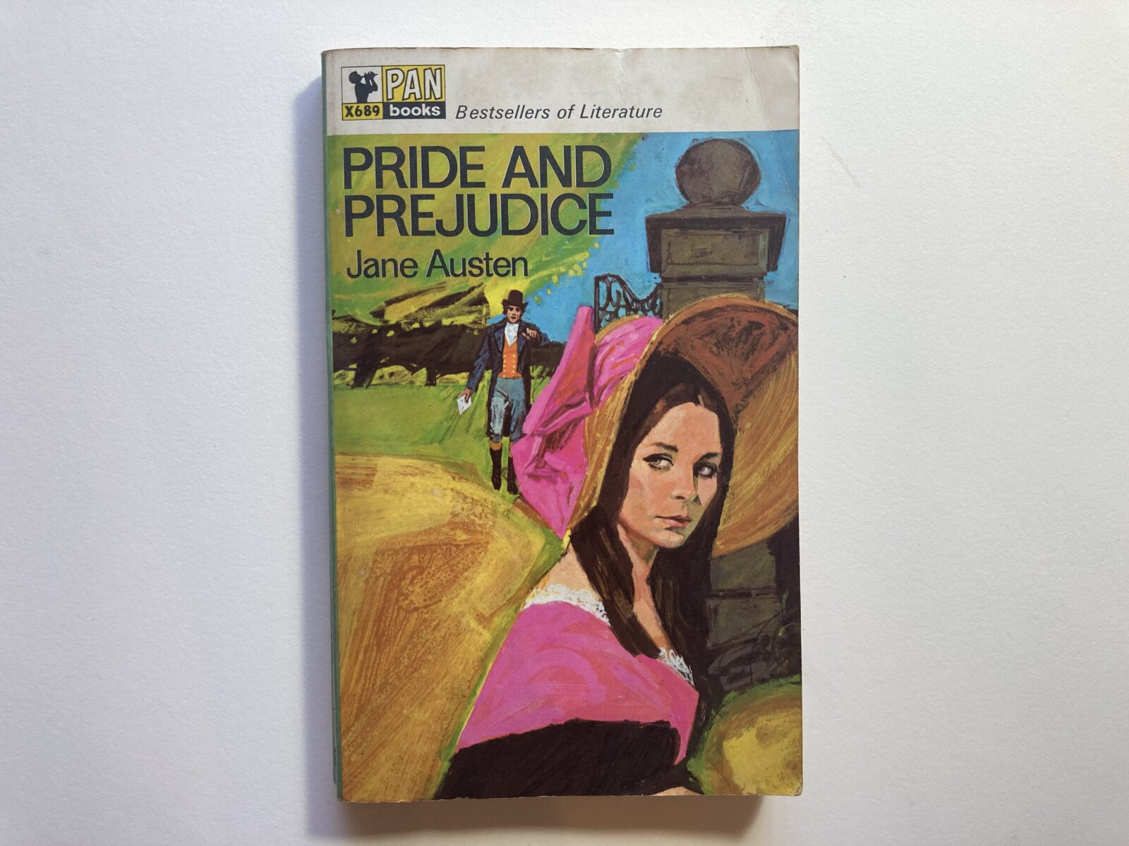
‘Pink’ editions:
Published by Washington Square Press, New York, 1964, and Pan Books Ltd, London, 1967
In the 1950s and 60s, as more women began attending universities, publishers issued bright, illustrated paperbacks of Austen novels, specifically aimed at a female audience. Their pink covers marked them out as intended for female students.
This strategy worked so well to attract female buyers that its legacy has actually narrowed the perceived appeal of Jane Austen’s novels, which are now often pigeon-holed as romances for women, or chick lit. Prior to this, Jane Austen’s novels were read indiscriminately by men and women.