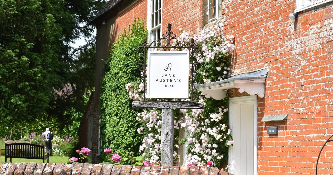
Jane Austen’s House brand
In 2020, leading design agency Pentagram developed a new brand identity for Jane Austen’s House.
The brand is distinctive, contemporary and rooted in Jane Austen’s history and the fabric of the House itself.
The logomark is inspired by Austen’s handwriting, specifically how she writes the name ‘Anna’ in a letter to her niece from 29 September 1815. From this, the design team created an elegant, stylised monogram combining the letters ‘J’ and ‘A’, which gives the identity a modern, but decorative feel.
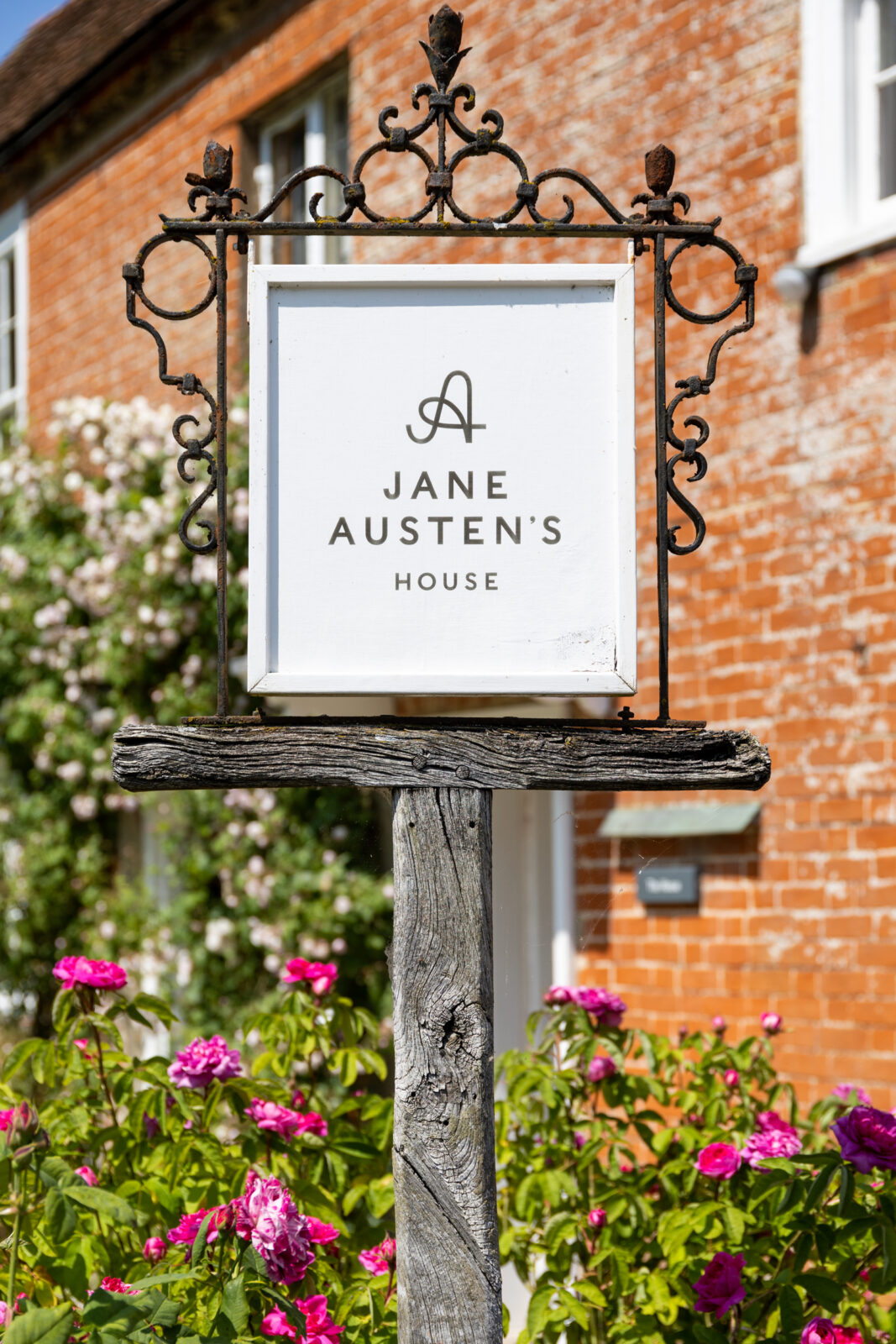
The proportions are based on the golden ratio, an important component of neoclassical architecture – the dominant style during the Regency period.
The identity uses two typefaces, Caslons Egyptian for the headlines and Caslon Doric for body copy. Caslons Egyptian is an updated version of ‘Two Lines English Egyptian’, the first commercially available sans-serif typeface which was released in 1816, a year before Austen’s death. Caslon Doric is Commercial Type’s modern take on the classic sans serif, and shares the same historical references as the headline font.
Despite looking surprisingly modern, the new colour palette was taken from original wallpaper samples found in the house and from the materials used in its construction. Austen’s distinctive twelve-sided writing table forms the inspiration for a neat twelve-sided stamp.
Despite writing about the foibles of early nineteenth-century society, Jane Austen continues to capture the imaginations of new generations of readers. Pentagram’s new identity provides a modern interpretation of one of Britain’s most famous literary figures, while respecting the heritage of her house and celebrating her enduring appeal.
Partner: Domenic Lippa
Project team: Josh Geoghegan Deo