Room 5: Isabel Bishop
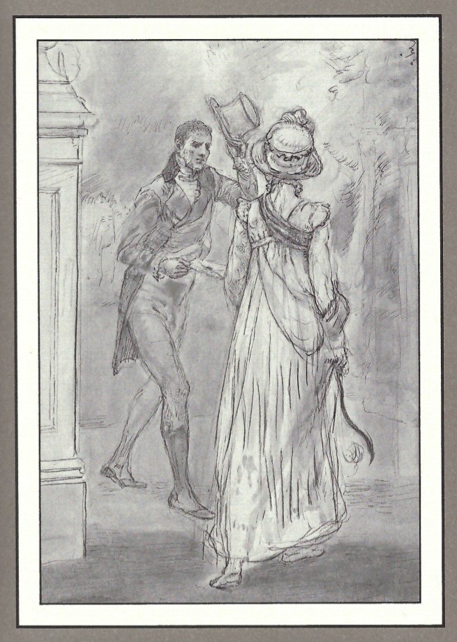
1976 Isabel Bishop - published by E. P. DuttonThis illustration was created by Isabel Bishop, an American artist who illustrated predominantly working women and students in New York from the 1930s to the 1970s. Bishop was known for her realistic style and her portrayal of the characters in the novel are honest and sensitive. Instead of creating a lighter, idealistic, even magical illustration (as we have seen in previous editions) she focused on the reality of a simple interaction. This 1976 edition includes 30 character illustrations.
Bishop’s artistic medium for E. P. Dutton’s new edition of Pride & Prejudice was black ink wash. Used heavily, it creates thick lines such as those on the back of Elizabeth’s dress, showing the folds in the fabric. Mixed with water, the ink could create the soft blending effect you can see in the trees in the background.
‘These drawings, for Pride and Prejudice, aim only to declare my own particular delight in the book – they are not trying the impossible task of embellishing an already complete and perfect work!
But my involvement in this undertaking has to do, also, with my feelings – wildly presumptuous – that in Jane Austen’s handling of the writer’s problem, certain minor factors relate (at the greatest possible distance) to my own efforts as an artist over fifty years’
– Jane Austen, ‘Pride & Prejudice’ (E. P. Dutton, 1976) Afterword by Elizabeth Bishop pp.415-16
Bishop also highlights a key point, ‘… while she [Austen] gives you the immediate social context of her characters, she is silent about the wider context (you don’t know the general economic situation, or that England was at war)’
It can be argued that this is why Bishop chose to illustrate her drawings in a realistic way, so they remained true to the context of the time period.


